
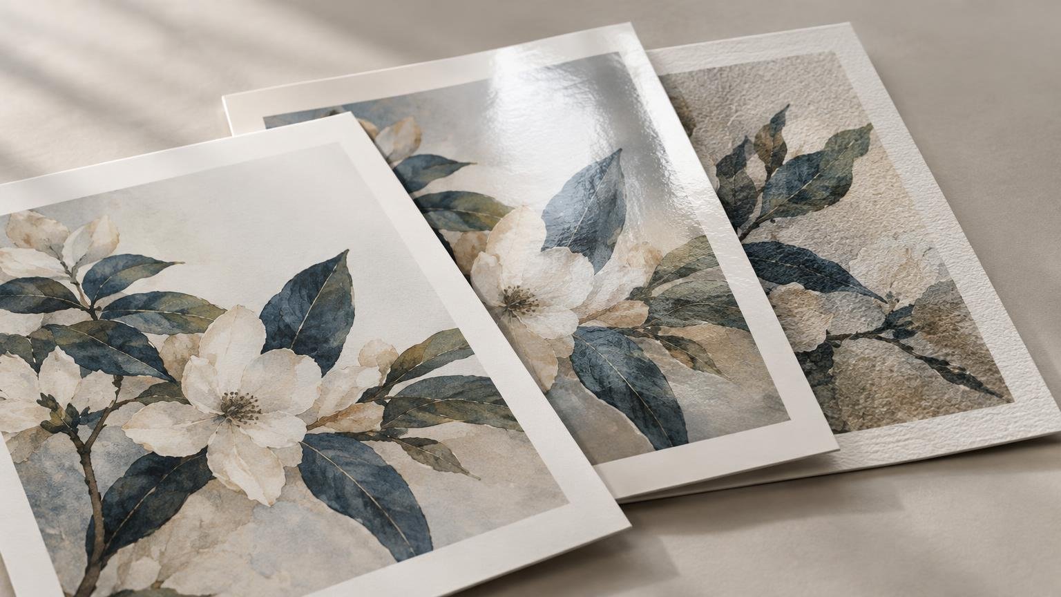
TLDR
The practical answer to matte vs glossy vs textured paper for art prints is to choose the surface that preserves the most important quality of the original. Smooth matte is the safest all-purpose starting point when you want low glare and an unobtrusive surface. Satin or gloss suits work that benefits from a sleek finish and strong visual impact. Textured matte makes sense when visible paper character supports the artwork rather than competing with it.
Do not make the final choice from finish names or screen previews alone. Print the same representative crop on one smooth matte, one satin or glossy paper, and one textured matte paper. Judge them at the intended print size, under realistic lighting and, if applicable, behind the glazing you plan to use.
Matte vs glossy vs textured paper for art prints at a glance
| Paper surface | Good starting point for | Main strength | What to check in a proof |
|---|---|---|---|
| Smooth matte | Illustration, drawings, gouache, subdued photography and painterly work | Low-reflection, visually quiet presentation | Black depth, shadow separation and whether the surface feels too flat |
| Satin or glossy | Photography, saturated digital work and polished contemporary images | A sleek surface that can give color and dark areas more visual presence | Reflections, fingerprints and appearance behind glazing |
| Textured matte | Watercolor, expressive mixed media and work in which surface character matters | A tactile surface that can echo traditional art paper | Fine lines, small text, flat color and whether the added grain feels artificial |
These are starting points, not rules. Paper makers treat smooth matte, textured matte, satin and glossy media as distinct categories, but papers within each category can behave very differently. Hahnemühle identifies surface structure, color gamut, density and feel among the parameters that matter when selecting a fine-art paper. It also notes that a reproduction can use a surface corresponding to the structure of the original work.
Sheen and texture are separate decisions
Matte and glossy primarily describe sheen: how strongly the surface reflects light. Texture describes the physical tooth or relief of the sheet. A paper can therefore be both matte and textured. In fact, many watercolor-like fine-art inkjet papers are exactly that.
The glossy category also needs qualification. High gloss, satin, lustre, pearl and baryta-style papers do not have identical surfaces. Satin and lustre usually sit between a fully matte sheet and a mirror-like high gloss. When a printer offers several of these terms, compare actual samples instead of assuming the names form a standardized scale.
This distinction helps simplify the choice. First decide how much reflection suits the image and display space. Then decide whether the paper should disappear visually or contribute its own physical character.
Choose smooth matte when the paper should stay quiet
Smooth matte is the most adaptable starting point for artists who are unsure which way to go. Its restrained reflection keeps attention on shape, line, value and composition. It is especially useful for pen-and-ink work, drawings, editorial illustration, gouache, soft photographic images and reproductions that will be viewed in rooms with difficult lighting.
Matte does not automatically mean muted color or weak blacks. Those qualities depend on the particular coating, ink set, printer, profile and image. For example, Canson describes one of its smooth matte baryta papers as supporting high black density, contrast, depth and vibrant color. That is a paper-specific claim, but it demonstrates why judging every matte sheet by the same stereotype is a mistake.
A smooth matte paper can still feel too restrained for an image built around luminous highlights, glossy painted surfaces or dense photographic blacks. In that case, compare it with satin before jumping directly to high gloss. Satin can add visual energy without producing the strongest reflections.
Choose satin or gloss for a polished presentation
Satin and glossy papers are strong candidates when the image depends on crisp photographic detail, saturated color, dramatic contrast or a deliberately polished appearance. They often suit digital illustration, graphic work, night photography and artwork containing smooth gradients or luminous dark passages.
The tradeoff is reflection. A surface that looks rich under controlled light can become distracting opposite a window or beneath spotlights. Glazing introduces another reflective layer, so a glossy print behind glass or acrylic may not gain as much from its sheen as an unframed sample suggests. Test the complete presentation rather than evaluating a loose sheet under ideal desk lighting.
Handling also matters. Marks and fingerprints tend to be easier to notice on reflective dark areas. Leave a handling border where possible, lift prints by their edges and use clean hands or appropriate gloves when the workflow calls for them.
Choose textured matte when surface character belongs in the image
Textured paper is most convincing when its grain supports something already present in the original: watercolor paper, dry brushwork, granulating washes, broken pastel-like marks or expressive mixed media. The goal is not to make the reproduction look more expensive. It is to give the printed object a surface that feels compatible with the work.
Texture can also change an image in unwanted ways. A pronounced tooth may interrupt hairline marks, soften tiny lettering or make a flat block of color appear uneven as light falls across the sheet. It can introduce physical grain into areas that were perfectly smooth in the original. Canson likewise treats paper texture, thickness and hue as separate choices that affect presentation.
Judge textured media at the intended viewing distance. A surface that seems intrusive from 20 centimetres away may settle into the image from across a room. The reverse can also happen: subtle texture visible in a hand-held sample may disappear once a small print is framed.
Match the paper to the artwork, not just the medium label
The original medium gives you a useful starting point, but the dominant visual quality should make the decision.
- Watercolor and gouache: Begin with smooth or lightly textured matte. Choose texture when it echoes the original sheet without exaggerating it. Use smooth matte when delicate edges, tiny details or clean negative space matter more than paper grain.
- Graphite, ink and line drawing: Start with smooth matte so fine marks remain visually uninterrupted. Compare paper whites carefully because a warm sheet can soften the apparent contrast of black lines.
- Digital illustration: Smooth matte works well for an understated, print-like object; satin is worth testing for highly saturated palettes, gradients and polished rendering. Avoid pronounced texture when the design relies on perfectly flat color or small type.
- Photography and photographic artwork: Satin, lustre and glossy surfaces are logical tests for images driven by tonal depth and a sleek finish. Smooth matte can be better for quiet portraits, soft landscapes or glare-prone rooms.
- Acrylic, oil and mixed media: Decide whether the reproduction should suggest the original surface or present the image as a distinct work on paper. Test texture cautiously; a generic watercolor tooth does not necessarily resemble canvas, board or painted impasto.
Ask one decisive question: what must survive the translation from original to print? It might be a velvety black, the softness of a wash, a razor-thin line, a luminous color transition or the physical impression of tooth. Give that quality priority over conventional advice about the medium.
Paper white changes the whole image
Surface is only part of the choice. Paper shade affects every unprinted highlight and influences how surrounding colors appear. A warm or natural white can complement earth colors, portraiture and traditional media. A brighter, cooler white may suit clean graphic work, cool palettes and images that depend on a crisp paper white.
There is no useful universal winner. Place candidate papers next to the original under neutral, consistent light. If the work contains open white areas, remember that the paper itself becomes part of the printed image. A visually pleasing sheet viewed alone can still pull the reproduction too warm or too cool.
Use the profile and media setting made for the paper
Choosing a beautiful sheet is not enough; the print workflow must account for it. Papers differ in shade, coating and surface structure, so manufacturers provide paper-specific ICC profiles and recommended printer settings. Canson advises using a profile designed for the particular paper and distinguishes matte-paper settings from those used for glossy media on compatible Epson printers.
An ICC profile helps the printing system translate color for a specific printer, ink and paper combination. The media setting can also affect ink limits, platen gap and other printer behavior. Select the manufacturer’s recommended combination when available. If a lab prints the work, ask which profile and settings it uses and whether it can supply a physical paper sample or small proof.
Do not compensate for a dull or overly dark proof by changing paper and editing the file at the same time. That makes the cause difficult to identify. Keep the image file, print size and viewing light consistent while comparing papers. Make file adjustments only after choosing the likely surface.
Do not reduce longevity to a finish label
Matte, glossy and textured are not longevity ratings. Preservation depends on the complete system and environment, including the specific paper, ink, display light, glazing, handling and storage. Treat vague terms such as “archival quality” as a prompt to inspect the paper and ink documentation rather than as proof of a guaranteed lifespan.
The Library of Congress guidance on caring for photographic prints recommends avoiding contact with image areas, limiting light exposure and storing prints in stable, cool and relatively dry conditions. Those principles are useful for finished reproductions regardless of surface, although handling needs and manufacturer recommendations can differ between materials.
Make the final choice with a three-paper proof
A small, controlled proof is more useful than debating finish names. Choose one smooth matte, one satin or glossy sheet, and one textured matte sheet that your printer or lab supports.
- Build a test crop containing the most demanding parts of the artwork: a deep shadow, pale highlight, saturated color, fine line and smooth area.
- Print the crop at the final reproduction scale. Enlarging a small proof changes the apparent sharpness and texture.
- Use the same source file and appropriate paper-specific profile and media setting for each sheet.
- View the dry prints beside the original under the lighting in which you normally assess color.
- Move them to the expected display space. Check them from close range and normal viewing distance.
- If the edition will be framed, place the proofs behind the intended glazing and check reflections from several angles.
- Mark what each paper preserves and what it changes. Choose the sheet that protects the artwork’s defining quality, not simply the one that looks most dramatic by itself.
For most artists, smooth matte is the sensible first proof because it is quiet, versatile and relatively forgiving of display conditions. Add satin or gloss when the artwork needs a more polished presence. Add texture only when that surface makes the reproduction feel more connected to the original. The right paper is the one that makes you notice the work before you notice the finish.
References
- Paper Quality Parameters – Digital FineArt
- Digital FineArt Collection
- Baryta Photographique II Matt | Canson Infinity
- Fine art paper: how to choose the right paper for a photo print | Canson Infinity
- ICC Profiles Epson
- Care, Handling and Storage of Photographs – Collections Care (Preservation, Library of Congress)