
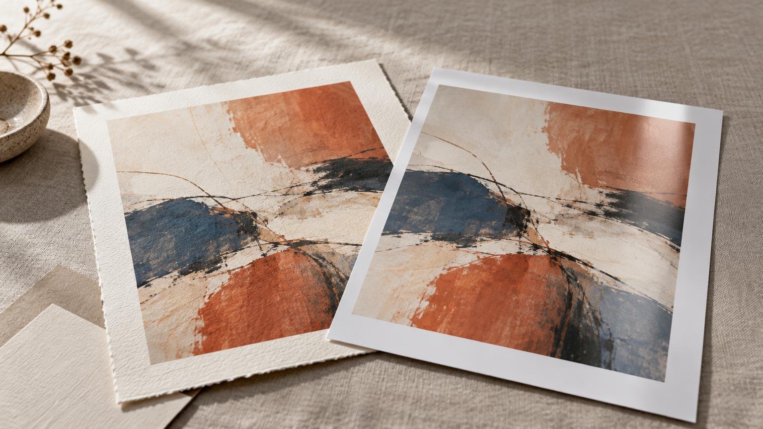
The practical difference is this: giclée usually means an inkjet print positioned for fine-art reproduction, often made with pigment inks on a carefully selected paper or canvas. A photo print may be an inkjet print on photo paper, a digitally exposed silver-halide print developed with photographic chemistry, or simply any print made from a photograph. The labels overlap, so the name alone cannot tell you which print will suit your artwork.
For paintings, drawings and mixed-media originals, I would usually begin by testing pigment inkjet printing on a fine-art paper. It gives you a broad choice of matte, textured and subtly warm surfaces. For artwork that calls for the polished appearance of conventional photographic paper, a silver-halide photo print—or an inkjet print on glossy or lustre photo paper—may be the better visual match.
TLDR: Choose the surface and process, not the marketing label
- Choose a pigment inkjet giclée print when paper texture, a matte surface, subtle color, or the tactile character of the original matters.
- Choose a conventional photo print when you want the smooth, glossy, lustre or pearl appearance associated with photographic paper.
- Ask the printer to identify the ink or imaging process, paper, surface and permanence information. “Giclée,” “photo print” and “archival” are not complete material specifications.
- Order a proof at the intended size before committing to an edition. Judge shadow detail, pale color, surface glare, paper tone and whether the print still feels like the original.
What does giclée mean?
Giclée generally refers to an inkjet-based fine-art printing process or market label. It does not identify the subject of the image: a giclée can reproduce a watercolor, oil painting, digital illustration or photograph. The term also does not guarantee a particular printer, ink, paper or lifespan. Research on the development of digital fine-art printing describes how inkjet technology became part of fine-art photography and printmaking, but the finished materials still need to be identified. This history of digital fine-art print technology provides useful context for the term’s development.
A clearer product description would be “pigment inkjet on textured cotton paper” or “pigment inkjet on smooth matte paper.” Conservation-oriented inkjet naming guidance from the Image Permanence Institute distinguishes prints by characteristics such as colorant, ink vehicle, coating and support. Those details tell you much more than the word giclée by itself.
What does photo print mean?
Photo print is even broader. It can mean an inkjet print on resin-coated photo paper, a digitally exposed silver-halide print processed with photographic chemistry, or a print whose subject happens to be a photograph. Some labs use the phrase for a particular product category without putting the production process in the product name.
A silver-halide print is materially different from an inkjet print. In a digital lab workflow, light or lasers expose light-sensitive photographic paper, which is then chemically processed. Fujifilm, for example, identifies Crystal Archive Digital Paper as silver-halide color paper intended for digital exposure and professional photographic applications.
Photo papers also come in distinct surfaces. Glossy can deliver a polished appearance and strong apparent contrast, while lustre and pearl surfaces soften reflections without looking fully matte. Fujifilm describes its Digital Pearl Paper as a silver-halide material with a distinctive lustre surface. That is a product-specific description, not a feature shared by every item sold as a photo print.
| Question | Giclée or fine-art inkjet | Conventional photo print |
|---|---|---|
| Typical process | Inkjet, commonly using pigment inks for fine-art work | Often digitally exposed silver-halide paper, though some sellers use the term for inkjet products |
| Common surfaces | Smooth matte, textured matte, cotton rag, baryta-style paper or canvas | Glossy, lustre, satin, pearl or other photographic surfaces |
| Often suits | Paintings, drawings, illustrations, mixed media and fine-art photography | Photography and artwork intended to have a smooth photographic-paper appearance |
| Best way to specify it | Name the ink or colorant, printer process and exact paper | Name the silver-halide or inkjet process and exact photo paper |
| Main decision | Whether the paper’s tone and texture support the artwork | Whether sheen, contrast and photographic surface support the artwork |
Which one preserves the character of original artwork?
Start with the physical qualities you want to carry across. A soft watercolor may benefit from a matte paper that keeps highlights quiet and lets pale washes remain delicate. A graphite drawing may need a smooth surface that holds fine lines without adding a competing texture. A saturated digital illustration might gain energy from a satin or gloss surface. A photograph designed around luminous color and crisp contrast may feel at home on lustre or pearl photo paper.
For artwork with visible tooth, brushwork or quiet areas of unprinted paper, pigment inkjet on a deliberately selected fine-art sheet is often the most flexible starting point. The range of available supports makes it easier to choose warmth, texture and reflectivity as part of the reproduction. If you are deciding among specific surfaces, compare matte, glossy and textured papers for art prints before ordering proofs.
Do not expect paper texture to recreate the original surface literally. A textured sheet can echo cold-press watercolor paper, but it cannot reproduce raised paint. Heavy texture may also interrupt fine linework or make small details appear softer. The goal is usually a surface that supports the image rather than impersonating the original material.
Print quality begins before the printer
Neither process can recover information missing from the file. Capture quality, resolution, editing and color management all shape the result alongside the printer, ink and paper. If the original has not yet been digitized, decide whether to scan or photograph the artwork according to its size, surface, condition and texture.
Keep a high-quality master file rather than resizing and repeatedly editing the only copy. The Library of Congress Recommended Formats Statement for still images recommends retaining master image files at the highest available resolution and bit depth, with an embedded or otherwise specified color profile. That is a preservation-oriented recommendation, but the same discipline gives you a stronger source for future sizes and papers.
A monitor preview is useful, but it is not the final print. Paper white affects every highlight, matte surfaces reduce glare and can change perceived contrast, and highly saturated colors may reproduce differently from the screen. Soft-proofing with the ICC profile for the selected printer-and-paper combination can help anticipate those changes; Canon’s professional printing guidance notes that paper manufacturers provide profiles tailored to particular printer families.
Is giclée more archival than a photo print?
Not automatically. Permanence depends on the exact combination of colorant, paper or other support, coating, display environment and storage conditions. Light, humidity, pollutants, water and handling can affect prints differently. Even one printer and ink set can produce different stability results on different papers.
The Library of Congress notes that pigment-based inkjet systems used with manufacturer-designated papers can provide more stable, permanent images under suitable storage conditions. That supports choosing a documented pigment-and-paper system, but it does not turn every print marketed as giclée into an equally permanent object.
Treat “archival” as the beginning of a question, not the end of one. Ask which ink or photographic process is used, what the paper is, whether permanence testing applies to that exact combination, and under which display conditions the result was measured. Manufacturer longevity figures can be useful when their conditions are included, but they should not be transferred to other papers, inks or processes.
How to compare print samples
Order the same image at the same size on two or three plausible papers. A small generic swatch can show surface and paper color, but a full-image proof reveals whether those qualities work with your art. Include difficult areas in the test: pale washes, deep shadows, neutral grays, saturated colors, fine lines and smooth gradients.
- View the proofs under the kind of light in which the work will normally be displayed. Check them in daylight and typical indoor light if both matter.
- Compare the paper white with the original. A warm sheet can soften cool color; a bright white sheet can make a gentle work feel sharper.
- Tilt the print to assess glare and surface texture. This often reveals a larger difference than looking straight at it.
- Inspect fine lines, shadow separation and pale transitions at a normal viewing distance as well as close up.
- Handle the edge or use clean gloves where appropriate. Fingerprints, scuffing and surface sensitivity affect packaging and customer care.
- Record the printer, process, ink type, paper name, profile or file version, size and date so the approved result can be reproduced.
Describe the finished print clearly
Once you choose a process, use specific language in edition records and product listings. “Pigment inkjet print on 100% cotton textured paper” gives a buyer useful information. “Silver-halide print on lustre photographic paper” does the same. Add the paper manufacturer and product name when they matter to repeatability and you can keep the specification current.
The print process does not determine whether an edition is limited or open. Either type of print can be sold in either edition structure. Decide that separately based on how you want to manage availability, documentation and future production; the practical differences between open and limited editions remain the same regardless of whether the work is inkjet or silver-halide.
The best choice is the proof that feels right
For most reproductions of paintings, drawings and mixed-media artwork, start with a pigment inkjet proof on a fine-art paper chosen to complement the original. For a smooth, luminous photographic finish, compare a conventional silver-halide photo print with an inkjet photo-paper proof. Fine-art photography can use either process successfully.
Then set the labels aside and look at the object. The right print carries the important qualities of the artwork—its line, color relationships, quiet areas, contrast and mood—without letting glare or paper texture take over. Choose the exact process-and-paper combination that achieves that result, document it, and use the same specification for the edition.
References
- A 15-Year History of Digital Technology and Print Permanence in the Evolution of Digital Fine Art Photography: From 1991-2006
- What is (and What Isn't) a Photograph Today?
- Inkjet Naming Conventions
- FUJICOLOR CRYSTAL ARCHIVE
- Fujicolor Crystal Archive Digital Pearl Paper | Fujifilm [United States]
- Recommended Formats Statement – Still Image Works | Resources (Preservation, Library of Congress)
- Mastering Print Settings & Plug-Ins | Canon U.S.A., Inc.
- Information Leaflet on the Care, Handling, and Storage of Photographs – Collections Care – Resources |Preservation | Library of Congress
- Paper – FAQ – About (Preservation, Library of Congress)